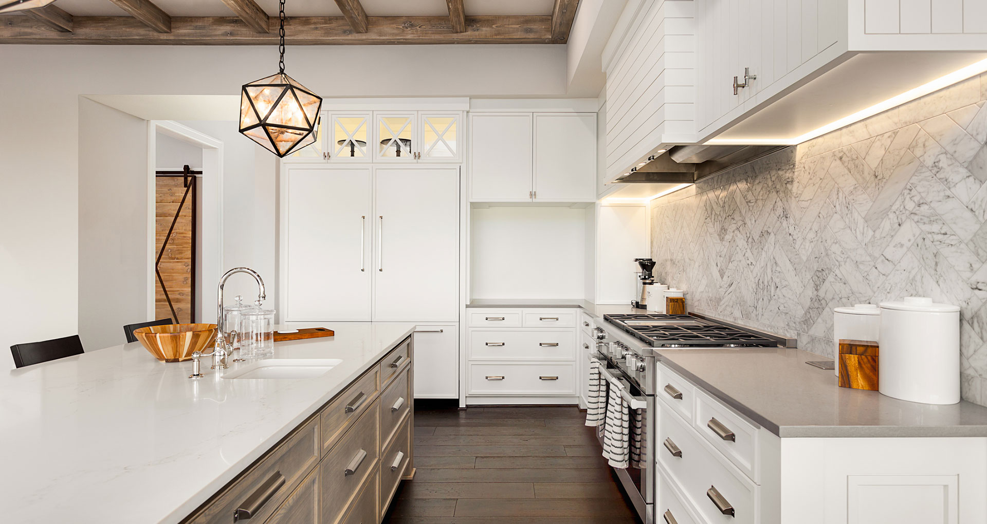
Choosing the right colors for your custom home can be overwhelming. It’s possible to change paint colors once they are on the wall, but it’s definitely a hassle, which is why it’s best to choose the right colors while you are meeting with the builder for your home. In order to pick the right paint for your home, use these tips from Alair Homes Orlando:
Take a Look at Your Clothes
Your clothes will let you know what colors you are already drawn to. If you are drawn to a more neutral color pallet for your wardrobe, then you will likely want a neutral palette for your walls.
Think about Existing Furniture
What color is prevalent in your existing furniture? There may be a reason other than the color why you picked the piece of furniture, but your existing furniture will have to match your new home so you want to make sure they will compliment each other.
Look to Artwork and Wall Hangings
In the same way you look at furniture, you should look at your artwork and wall hangings. You want to make sure that these compliment the wall colors.
Think about the Mood of the Room
What do you want the mood of the room to say? Do you want something cozier or do you prefer something that is lively? If you want something cozy, you may want to choose beiges. For something more serene, blues and greens will create a relaxed look.
Pull from a Favorite Accessory
If you have a favorite pillow or rug, take a look at the colors you are drawn to and see if that color may look good on your walls.
Think about the Whole House
While each room can have slightly different colors or a different feel, you want to think about the whole house and make sure that each room flows into the other. Working on the whole house color palette will help create the holistic look, instead of just focusing on one room at a time.
Take Advantage of the Color Wheel
Once you have taken a look at your furniture and other colors that you may think will look good on the wall, use the color wheel to find colors that will match. There are complementary colors that will look good next to each other and are opposite on the color wheel. Some examples of these are blue and yellow. An analogous color scheme are those colors that are next to each other on the color wheel, but still can work well together. Examples of these are blue and green or red and orange. If you prefer a monochromatic look, you will want to choose different shades of the same color.
Learn the Terminology
Learning the terminology will help you when it comes to picking shades. Hue is the color, while saturation is how strong the hue is. Intensity means how brilliant the color is. For example, lighter colors should be more saturated so they don’t just appear white. White can look too stark.